
El Sewedy
Branding
Services
Client
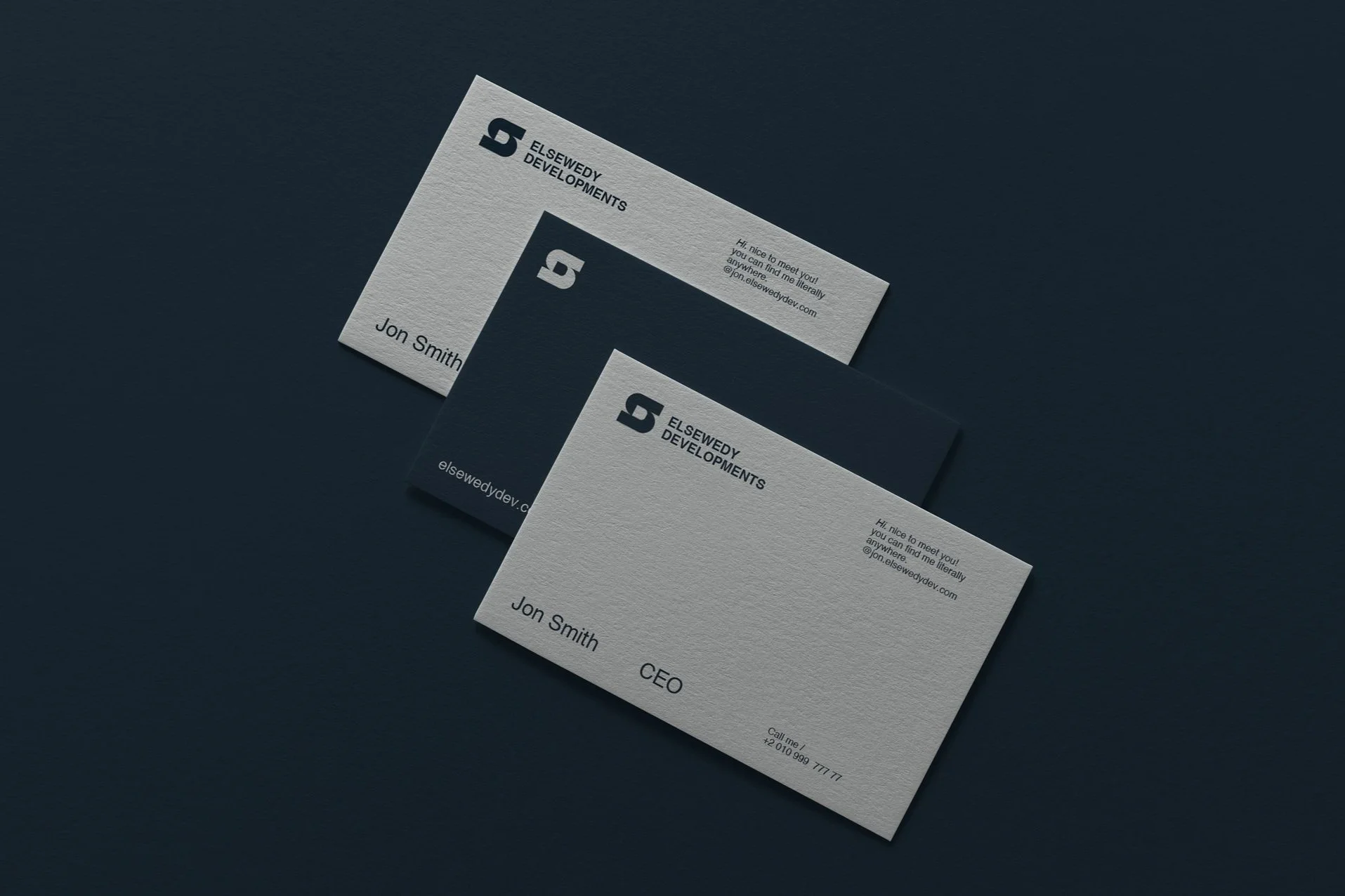
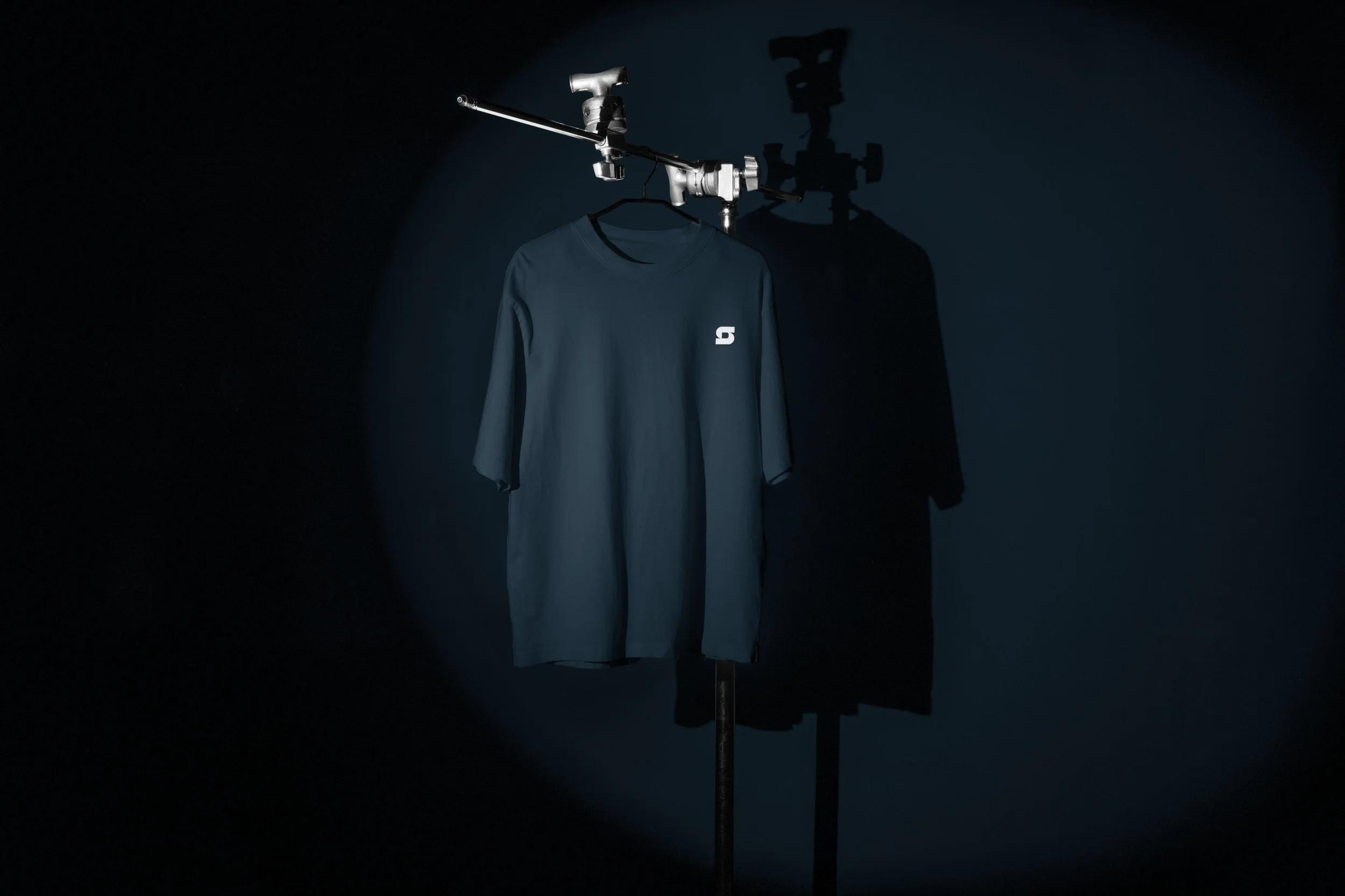
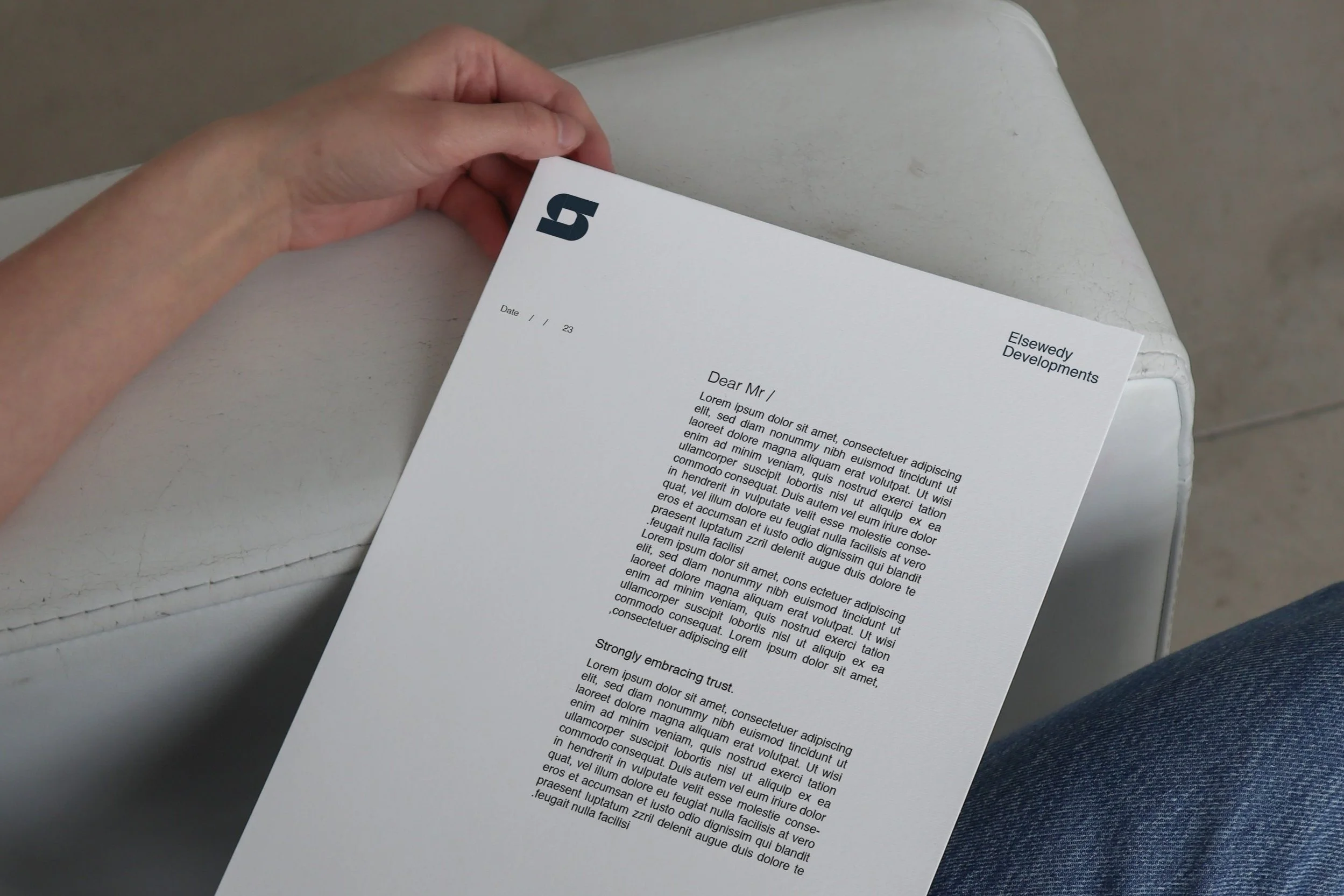
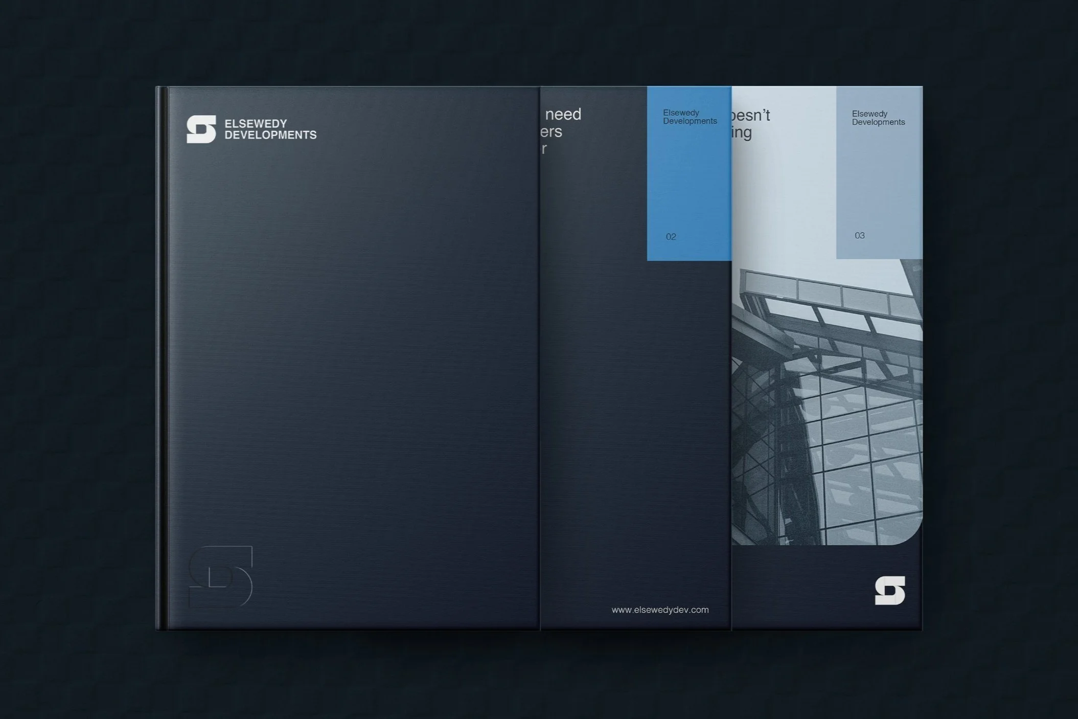
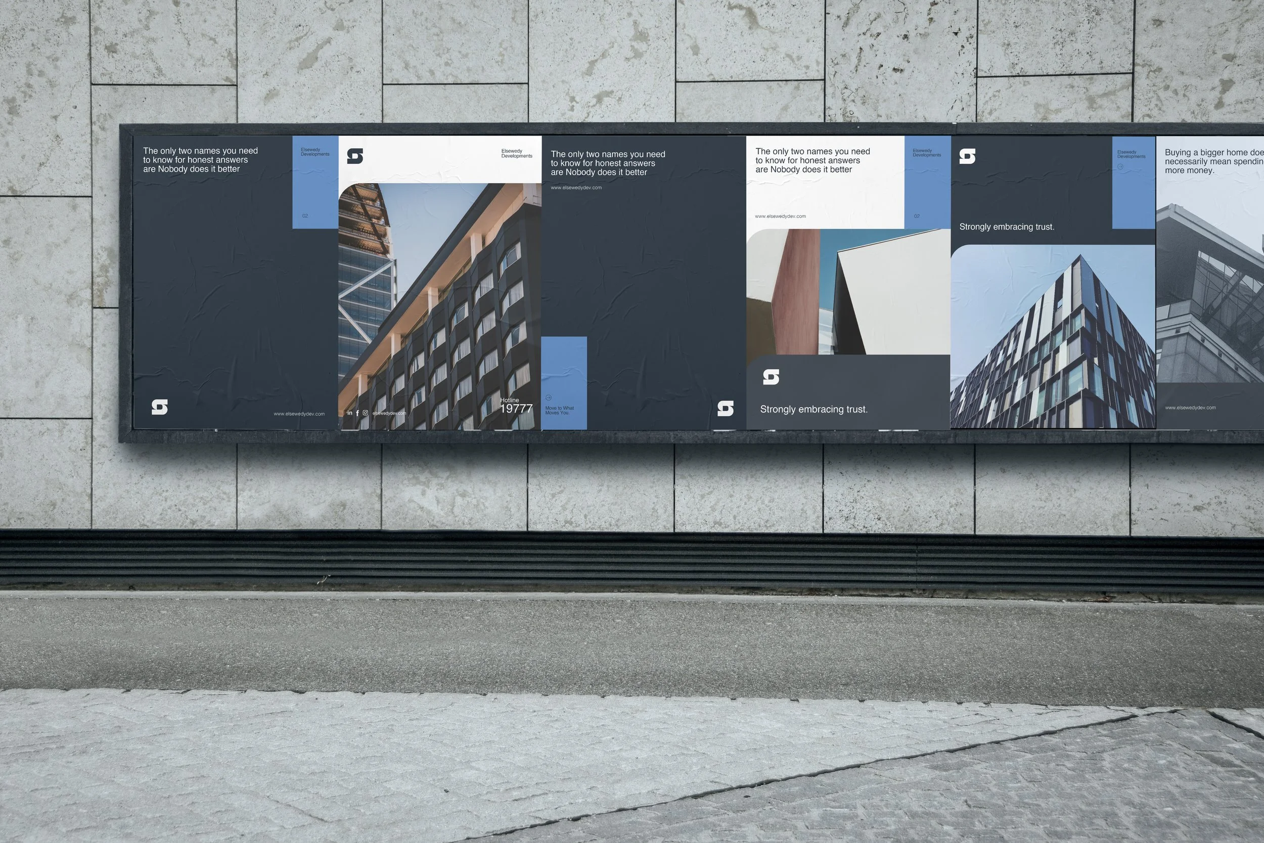
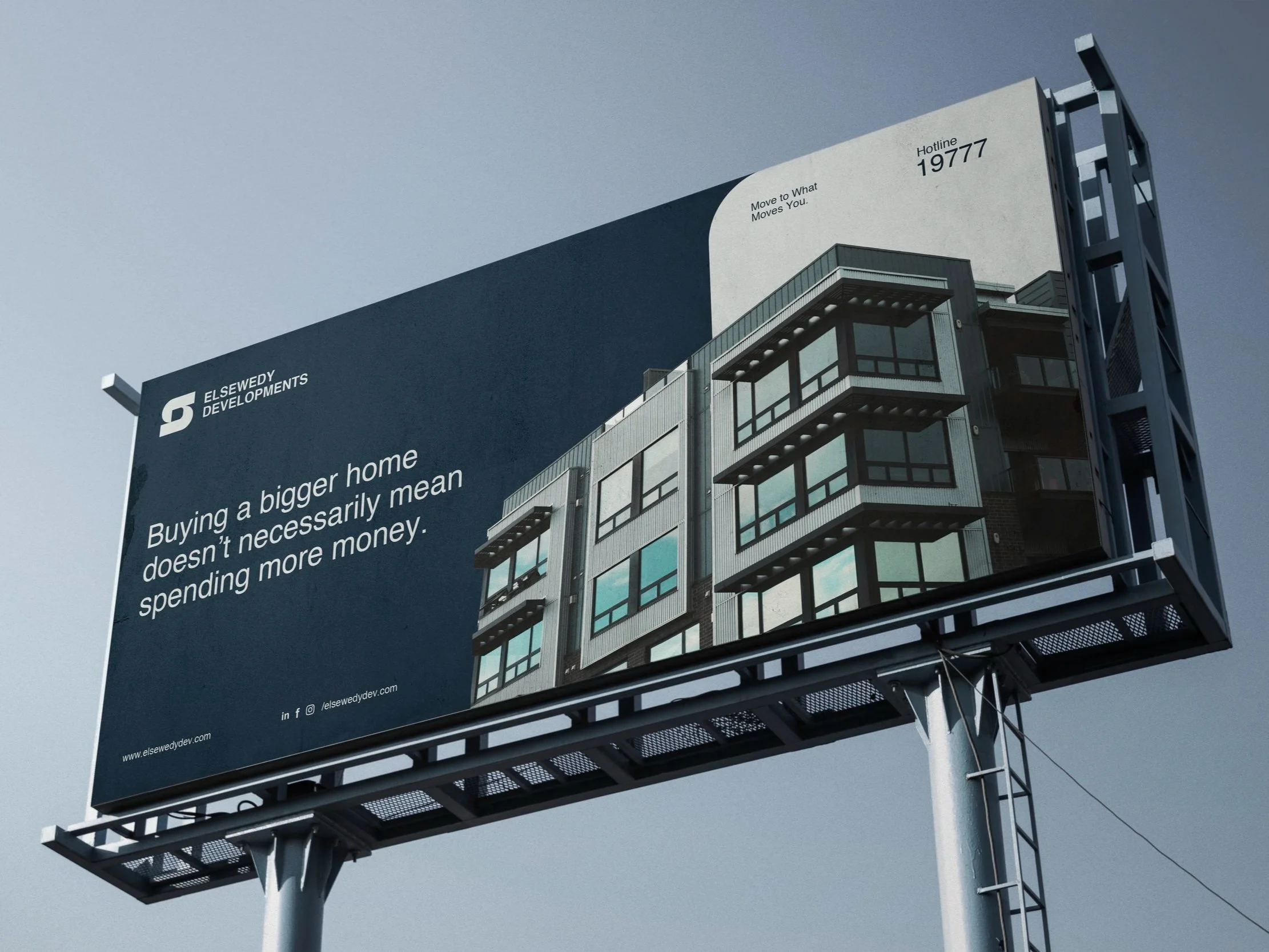
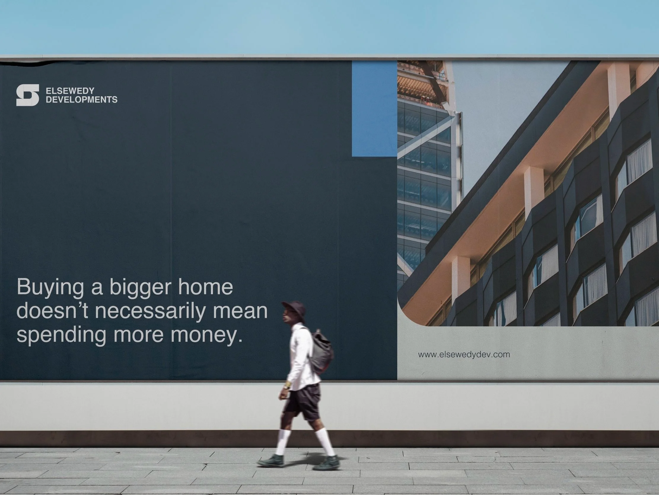
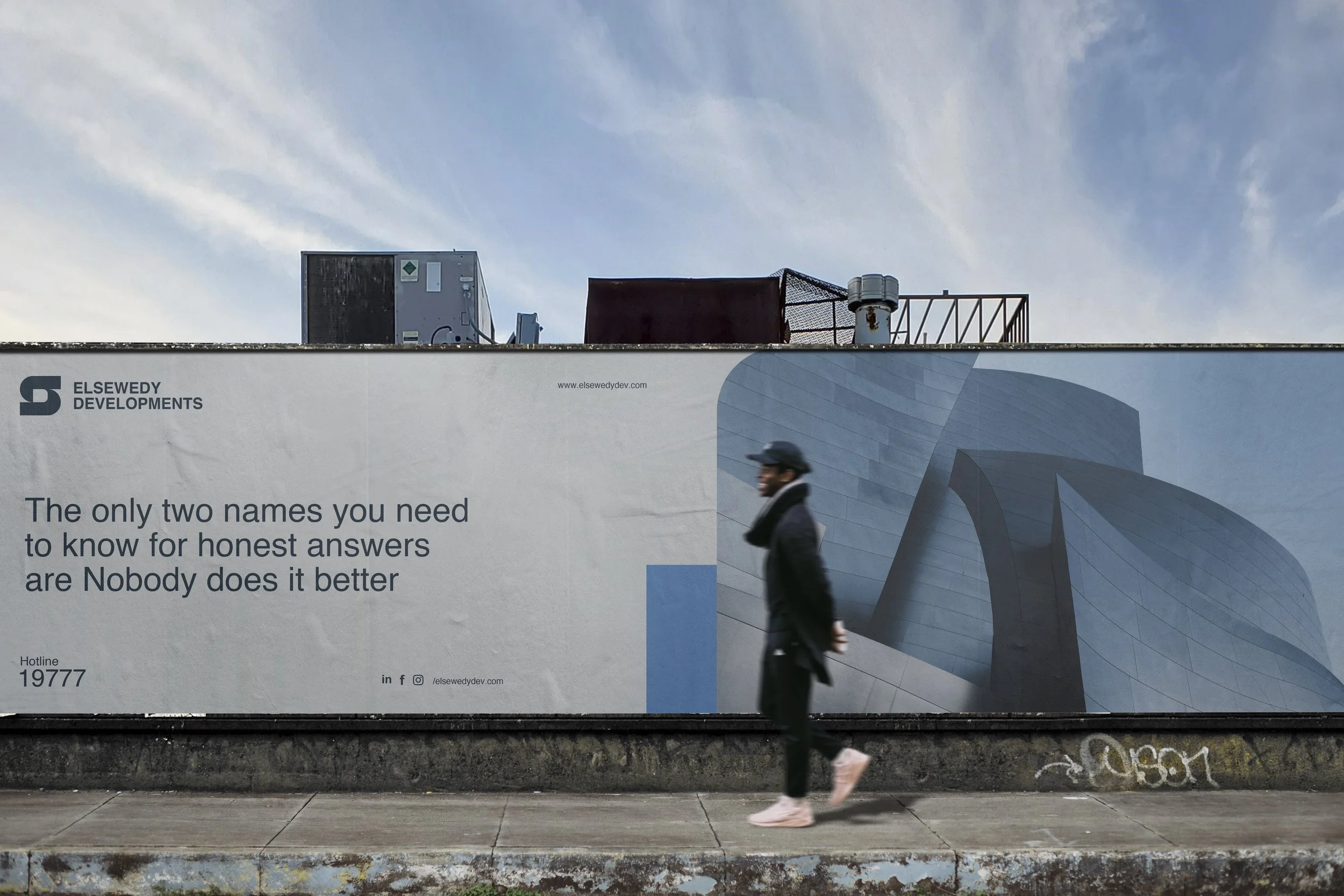
In crafting the identity for El Sewedy Developments, our focus was on a logo that goes beyond mere initials, embodying the very essence of the brand. The intertwining of the letters 'S' and 'D' serves as a visual metaphor, symbolizing the strength and unity that are the pillars holding the company together. This deliberate connection extends beyond typography, echoing the interconnected nature of El Sewedy Developments.
MORE PROJECTS
WOC
Bloom